Re-design Overview
My team and I were given a large-scale project with a tight deadline that required us to redesign 10 major tronc properties, across 3 devices that included building out a design library that held 600+ features and 40+ page templates and their variations. Adopting the agile methodology helped us focus on an iterative approach to the design and development process. Not only did we redesign and evolve the brand experience, we had to migrate the CMS system to ARC and establish a design framework across all properties, platforms and devices. The following case study is just one of the multiple deep dive projects I worked on.
Re-design Overview
My team and I were given a large-scale project with a tight deadline that required us to redesign 10 major tronc properties, across 3 devices that included building out a design library that held 600+ features and 40+ page templates and their variations (that were constantly iterated on). Not only did we redesign and evolve the brand experience, we had to migrate the CMS system to ARC and establish a design framework across all properties, platforms and devices. The following case study is just one of the multiple deep dive projects I worked on.
Project Role › Product Designer
Team › 4 people
Deliverables › Research | Competitive Analysis | User Flow | Design | Prototype
Sprint › 2 weeks
___
Goal
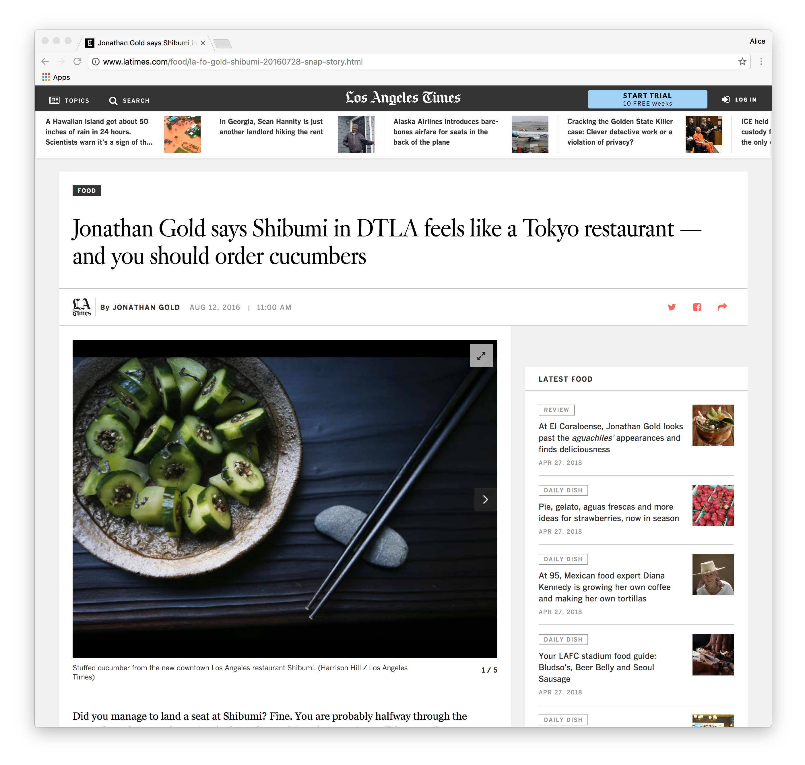
The goal was to improve the photo gallery experience by creating something that was both new and exciting, but also represented the depth and breadth of the coverage while still retaining the LA times sophisticated LA Times branding. To us, that meant designing an experience that met and balanced the needs of the newsroom alongside development limitations.
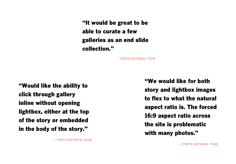
Collaboration and communication were key to the process. I worked closely with the newsroom, developers and in-house team to determine needs. To start, I sat down with the L.A. Times photo team to gain insight on current tools and how they’re used today, where current experiences are falling short of their expectations and how my team and I can help improve their workflow. Below are quotes gathered
_________
Competitive Analysis
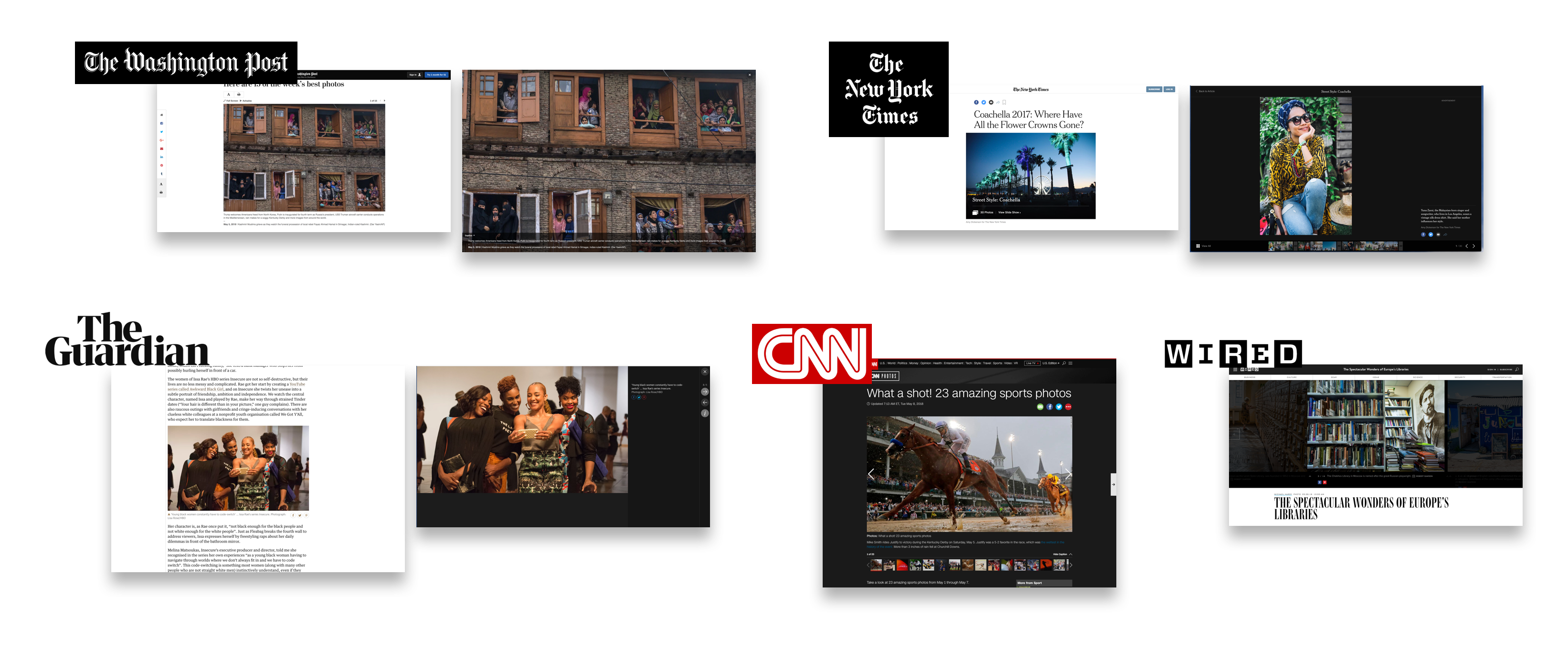
I looked at other media publications such as Washington Post, CNN, Wired, NYT, Gaurdian to compare what was being done in the market. It became clear which would be the starting point for the wire framing process and user flow.
_________
Competitive Analysis
I looked at other media publications such as Washington Post, CNN, Wired, NYT, Gaurdian to compare what was being done in the market. It became clear which would be the starting point for the wire framing process and user flow.
_________
User Flow
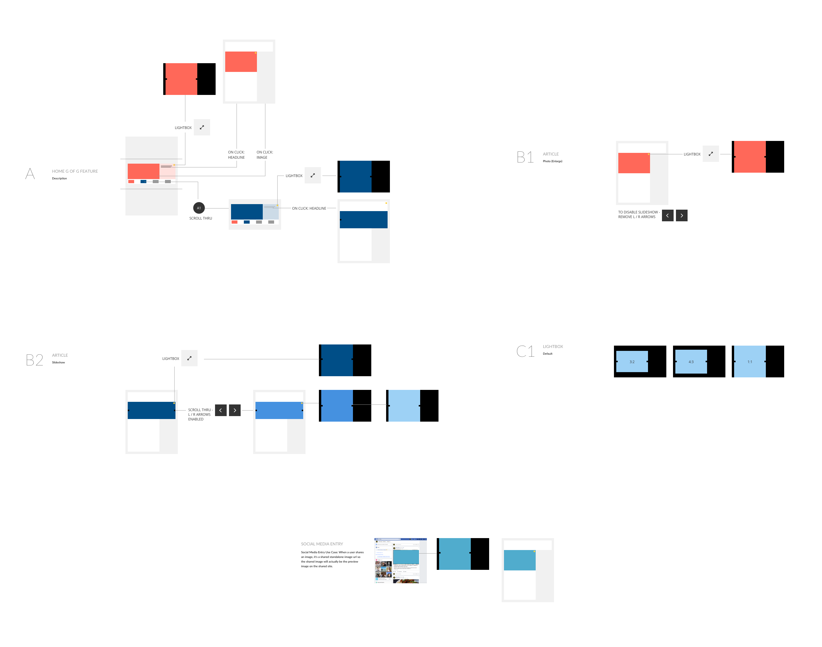
Having established a better understanding of the user, I was able to create a flow for the key tasks within the page. By carefully going through the flow, it helped to see how the user would interact with the site to achieve the goal.
_________
Design
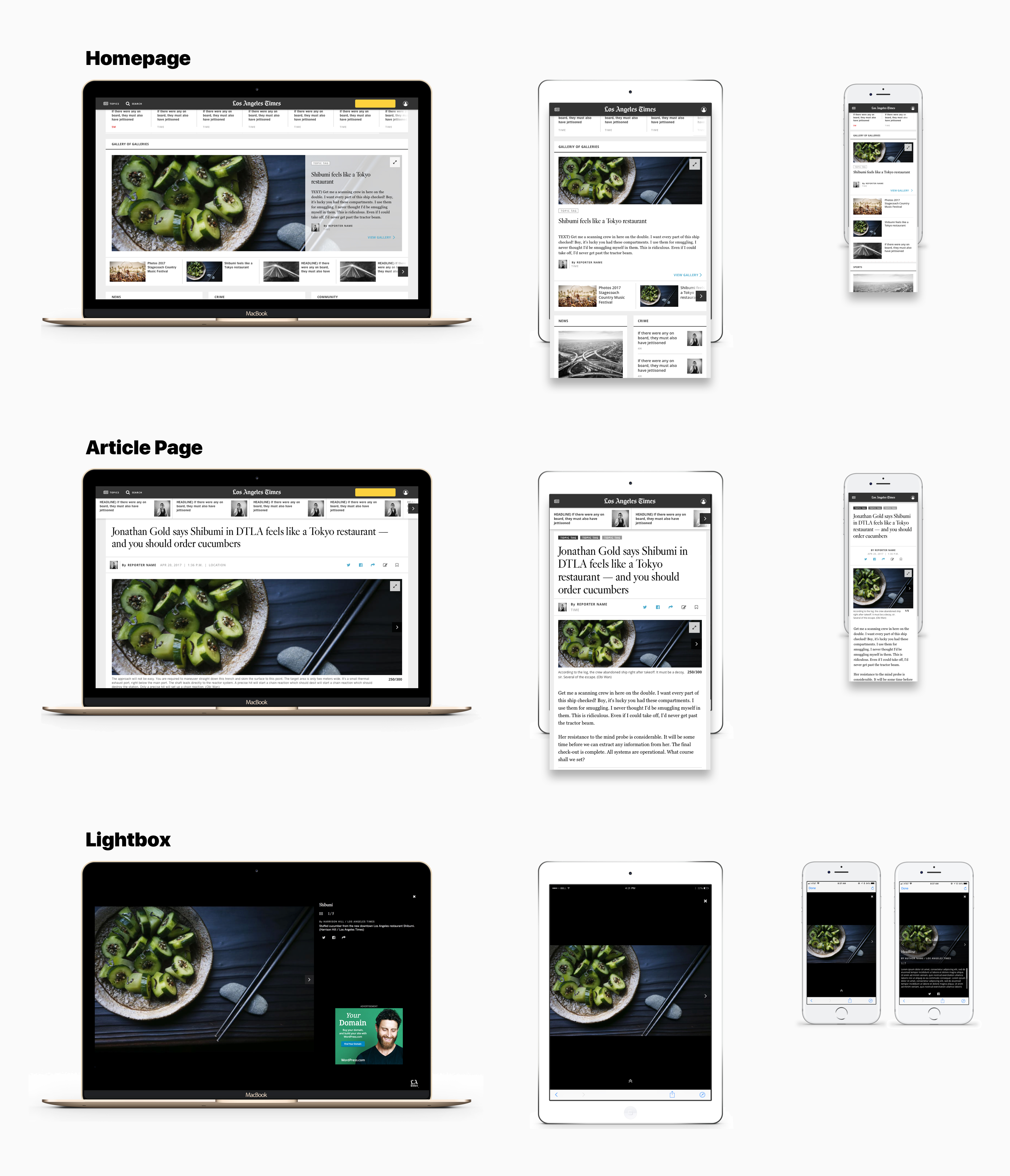
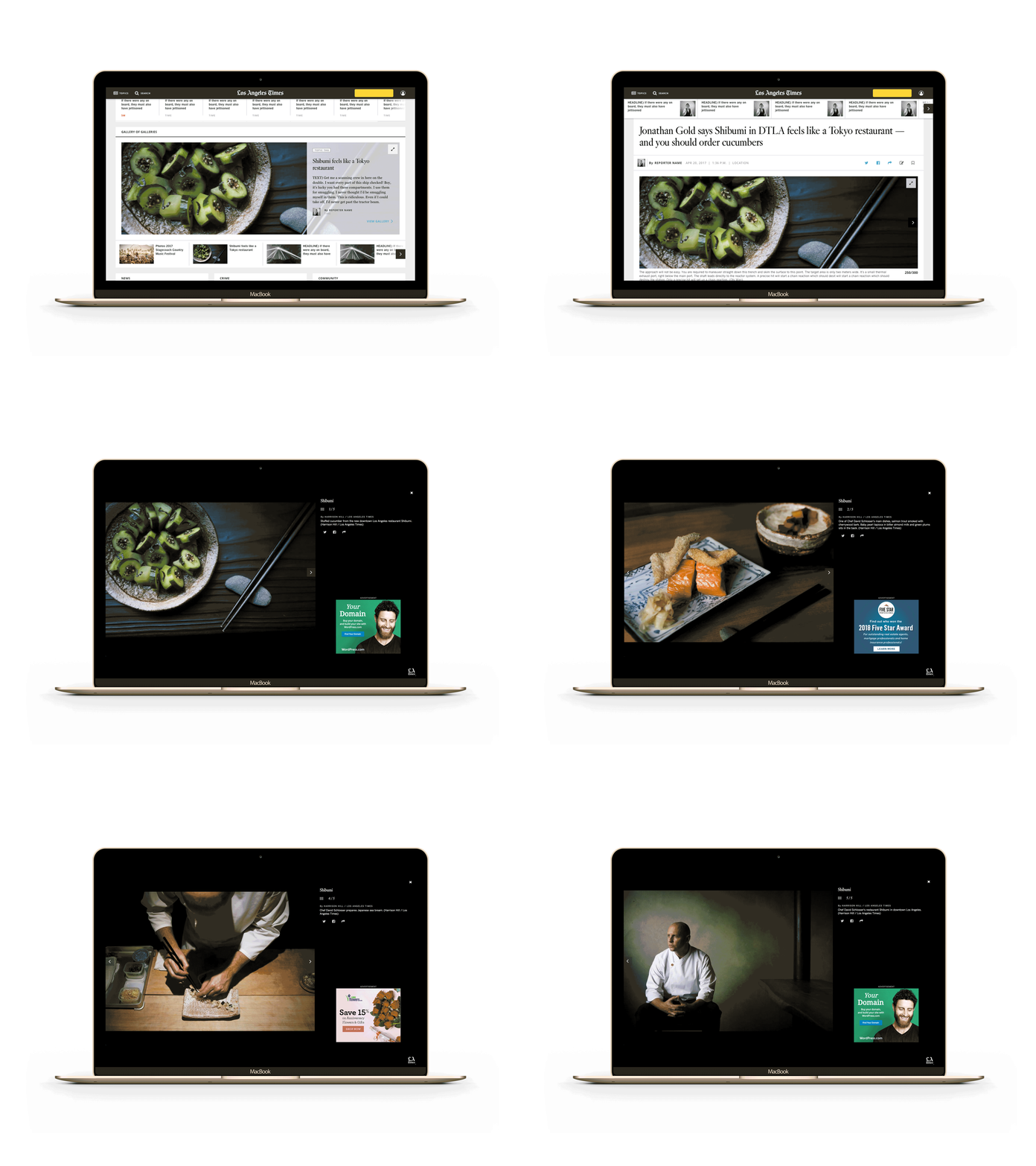
Next, I was able to explore several layouts for each design deliverable that focused on functional density before settling on a design that supported multiple components and features: I landed on the designs shown below for two reasons. First, it’s an established pattern that’s recognizable and credible within the news industry. Second, this structure allows us to display more photos and increase engagement without the user needing to dig for it.
Lightbox
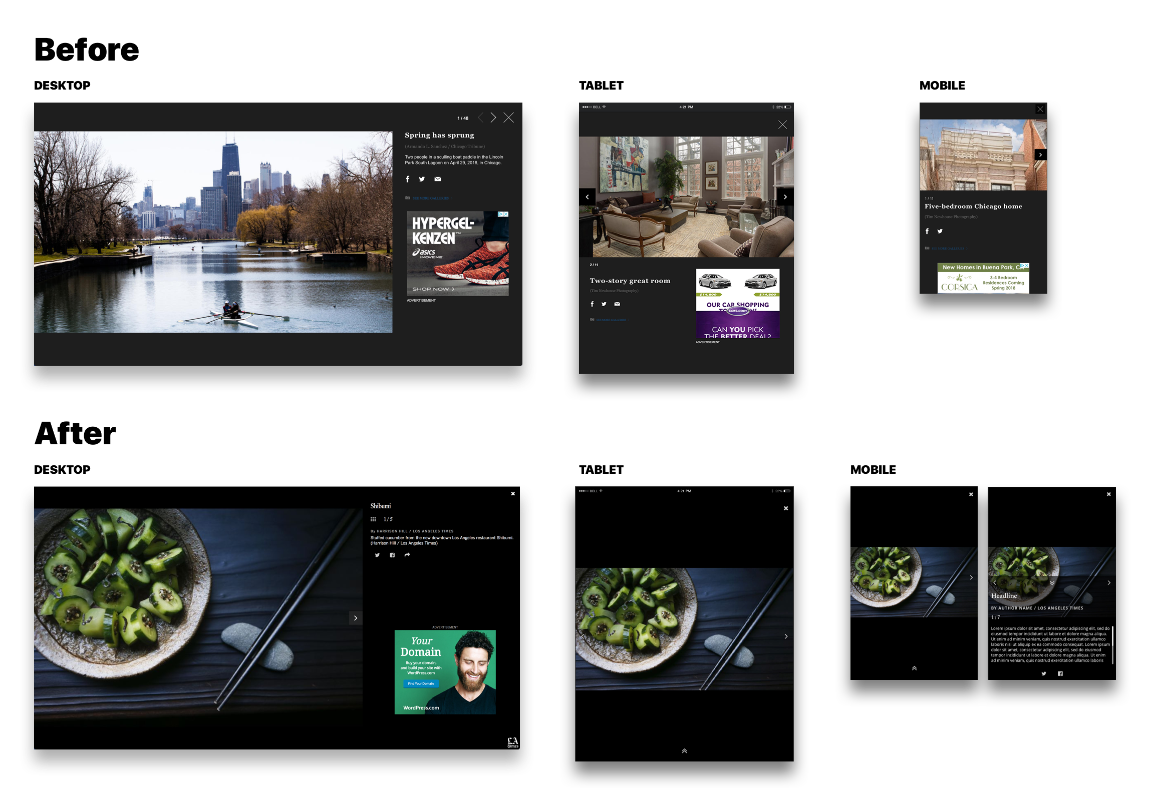
It took lots of finesse to get the light box working just right. Because it was so visually trimmed down, I had to make sure the typographic hierarchy and spacing were working cohesively for all devices. The black background for the light box is a seemingly simple detail that holds the gallery together. The image shows the evolution of our designs for each device.
Home / Topic pages
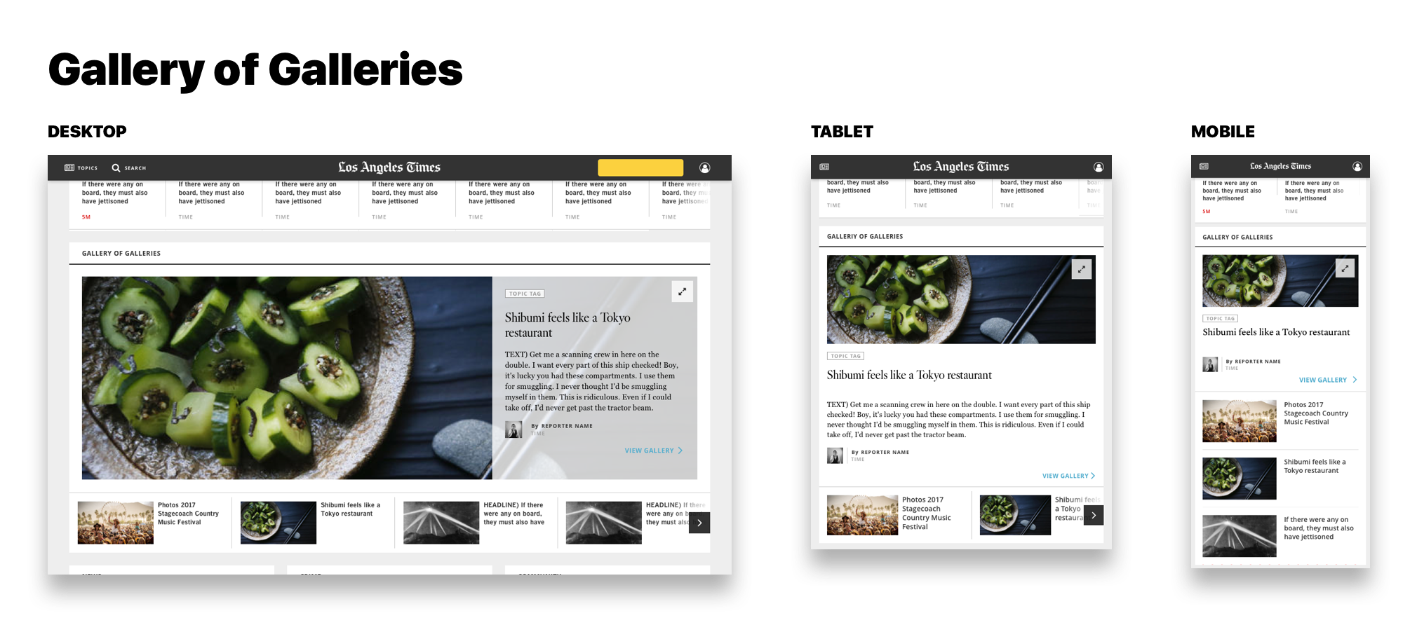
The primary goal of the carousel below was making it easier for users to get around photo galleries in contrast with the previous homepage which didn't provide any. This carousel has two key areas: quick access to different galleries, inline browsing of other galleries. This structure is consistent across all of the home, topic, and article pages.
ITERATE
After landing on layouts and designs, I had the opportunity to present prototypes in front of my team members and developers to get feedback using Invision, which happens iteratively.
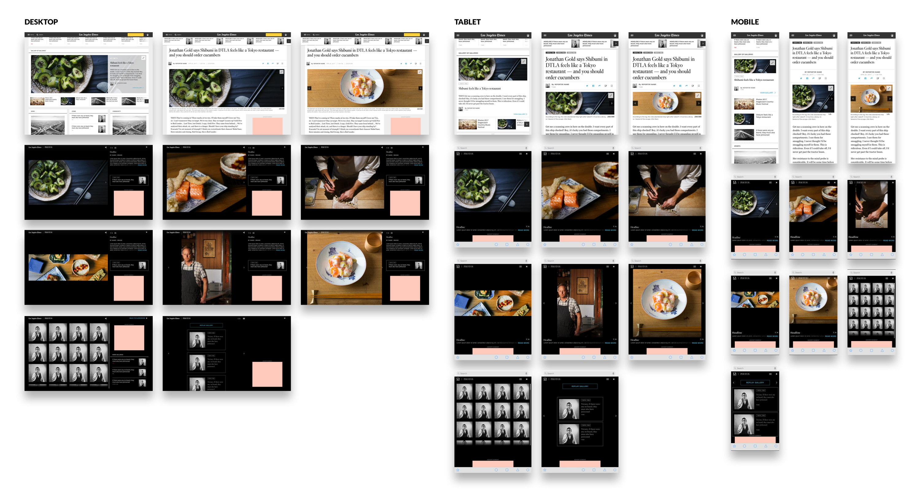
Based on learnings from the initial launch, my team and I were able to make any necessary improvements to optimize the light box experience. 3 key areas to improve:
1. Opens of galleries from articles and section fronts
2. Search engine referrals to standalone gallery page
3. Engagement on gallery lightbox views
ITERATED DESIGNS BELOW
Projects
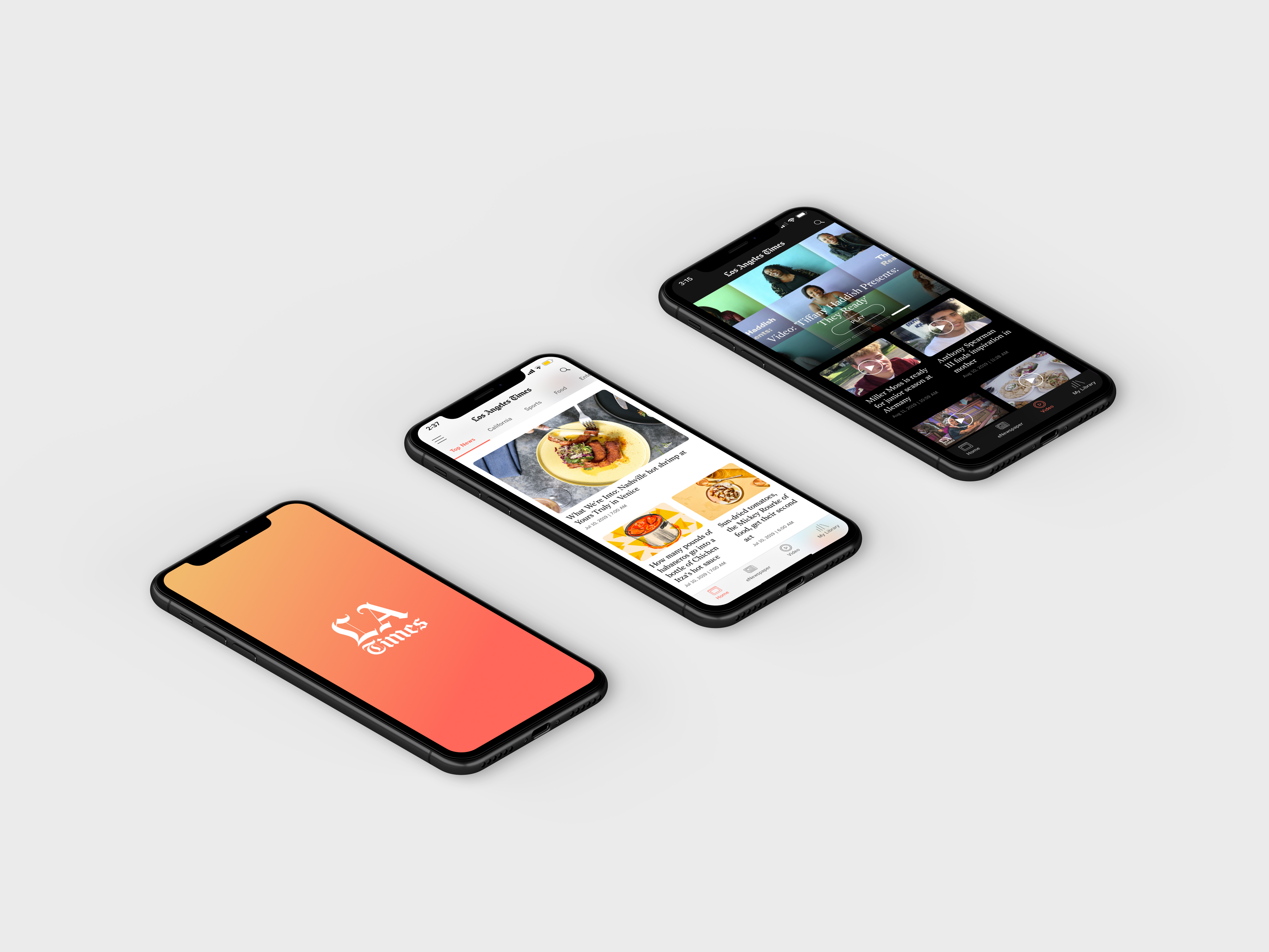
Los Angeles Times AppNewsreader App Re-design

Data DashboardsAnalytics
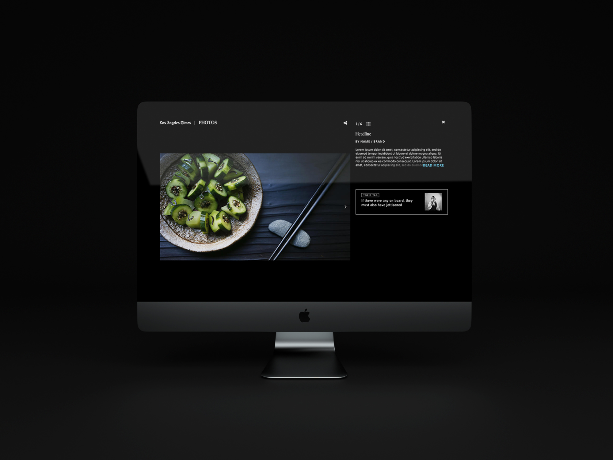
Los Angeles Times Re-designCase study : Photo Gallery Re-design
mmmonika websitewebsite design

Style GuideLos Angeles Times
